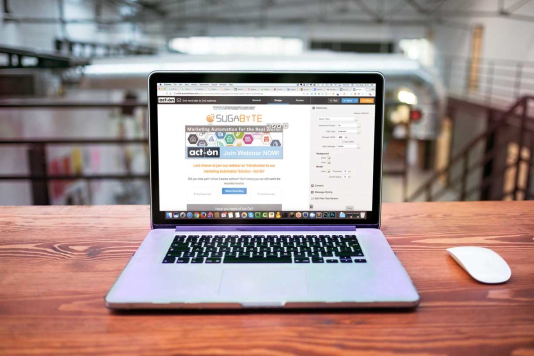
It’s common practice when designing an email that the correct colour palette is chosen, a few eye catching images are added, there is a great subject line, however, what’s often forgotten about when designing emails is that there is a basic principle that the email itself doesn’t end up straight in the recipients spam folder where it will remain unopened.
Emails are often subject to scrutiny by the recipient’s mail server. In order to prevent bounce backs from happening, there are ways in which you can optimise the email design to help ensure that the message makes it through to the intended recipient.
Our 5 Best Email Practices are Listed Below
From addresses
Most recipients will use the ‘from’ header to decide whether or not they want to open your email, as a sender you will need to ensure that you’ll be recognised and not reported as SPAM. Ensure that your audience will recognise you by using your name or the business name or create an email address that identifies who you are and what you are sending e.g [email protected].
Subject Lines
A subject line is what gives your audience a hint at the content of your email. This for many recipients will determine whether or not they open the email. Best practice would be to clearly and accurately describe the content of the email in the subject line and highlight any benefit or create any sense of urgency. You can also use A/B testing to test different subject lines to see which is better received. It’s good practice to avoid making the subject line too long, most email programs will only display the first 30-50 characters. If this email is likely to be opened on a mobile device, keep to below 30 characters.
Working with images
Avoid busy background images that make your text hard to read, if the recipient has to struggle then they will most likely give up. Make sure that the images support the text in your email and are not just a generic image. Remember to use alt text for your images, this allows people whose ESP automatically blocks images to know what the images are. This will also allow the visually impaired to know what the images are.
Email Width
Keep all emails to around 600 pixels wide at its maximum width, this will allow your emails to display properly within most email clients and ensure that they can be read easily.
Mobile best practices
If a call to action button is included then it needs to be obvious and tappable with a minimum size of 44×44 px. Buttons on mobiles don’t offer a “hover” state so you need to ensure that the button is visually clickable, this could be via outlines, subtle shadows or other effects. With mobile, you need to ensure that the font size, line space, and button sizes are big enough to allow for ‘fat-finger’ errors.


